PPC ads are one of the most effective marketing strategies to get more customers, whether you have a product or service. The problem is, all businesses know this so your competition is steep.
To stand out, you need to craft engaging, eye-catching ad copy and design that makes your potential customers stop and take action.
But it can be difficult knowing how to write high-quality ad copy. From conveying the benefits of your product or service to convincing your customers you’re the right choice, how do you cram everything you need into one, well-written ad?
This post will show you the process.
Crafting a strong CTA for your PPC campaigns can be difficult at times, which is why we’re here to help. Send us a message or give us a call and let’s see how we can make your ads more click-worthy.
What is Ad Copywriting?
Ad copywriting is the content you create for your PPC campaigns. The purpose of the ad copy is to increase your conversion rate by convincing your audience to click your ad or take action.
In general, ad copy highlights the value and benefits of your product or service and communicates them in a way that your audience relates to.
When written well, ad copy is one of the best ways to increase your conversion rate and boost your ROI.
Creating Effective Ad Copy

You’ve probably seen hundreds of ads online, but ignore most of them. Good ads are easy to spot because the copy is interesting, engaging, and draws you into the rest of the ad.
From the powerful headline to the final CTA button, each part needs to be well-written and strategic.
Types of Hooks to Use in Your Ad
There are four easy psychological hooks you can incorporate in your ad copy that will grab your reader’s attention and inspire action:
Emotion
Make them connect to your product or service through feeling. Whether it makes them happy, excited, nostalgic, or angry, people connect with things that elicit emotion.
Pain
Highlight a pain point in their life and show them you understand the issues that come with it. This forms an instant connection and encourages them to start thinking of your product or service as the solution.
Logic
Use stats, percentages, or a comparison to appeal to the logical side of your customer. If ideal customers can see your product gets results, it becomes logical to choose you as a solution.
FOMO
The fear of missing out has always been a driver of human behavior. But since the era of social media, FOMO has become a powerful driver of marketing. No one wants to feel like they’re missing out, so if you can position your product or service as exclusive, it will make people much more willing to take action.
Structuring Your Ad

When you begin structuring your ad, there are so many opportunities to optimize for conversions:
- URL
Your ad will need a URL that users click to go to your landing page or product page. The display URL is a shortened version of the real URL that looks cleaner, is easy to read, but still conveys what the link leads to.
The final URL is more specific and allows you to include rich tracking information.
- Headline
The headline is the most important part of your ad copy. This is the first thing that the user will read so it needs to immediately qualify them as the ideal person for the ad.
In just a few words, you need to convey the most important message of your ad. This might be the benefit, offer, or time limit.
- Display Path
The display path is usually under the headline and above the description in Google ads, however it isn’t a feature in other ad channels. This is a URL that gives your customer an idea of where on your website they will land when they click the ad.
This is an ideal place for keywords that describe the product or service. If this is an incoherent jumble of letters, it’s going to put potential customers off clicking.
The path field is an optional part of expanded ads and has a character limit of 15 so use it wisely.
- Description
The description is the central part of your ad copy. But this doesn’t mean you should give a long description of your product or service. Instead, use this space to highlight the benefits, qualify your customers, and offer real value.
Remember, most people won’t read a chunk of text, so this needs to be simple and to the point.
Using Ad Extensions
Extensions are an option to give more information without cluttering the main ad space. If someone has clicked the extension to read more, they are a warm lead and want to find out more about your offer, so this is a good place to go into a little more detail about the benefits.
Ad extensions increase click-through rates and can include location information, links to specific web pages, CTA buttons, as well as additional text content.
Leverage keywords
It’s tempting to jam your ad copy with as many keywords as possible to show in more searches, but this can actually reduce your conversion rate.
Audiences are bombarded with ads every day, they know when they are spammy and low quality. So it’s your job to curate specific keywords that relate to your product or service as closely as possible.
If you were a photographer looking for social media marketing services, which of the following ad copy descriptions would you click:
- Affordable social media marketing services for entrepreneurs
- Monthly social media marketing packages for photographers based in Los Angeles
The second includes a couple of ultra-specific keywords that will immediately qualify potential clients and show them the ad is perfect for them.
Show people how you can solve their problem
Keywords are important, but potential clients are looking for a solution to their specific problem. So you need to show them you are the solution.
The keywords you bid on will affect your Quality Score, but you and your competitors will be using the same keywords. The way you stand out is by showing how you solve a problem in your ad copy.
Focus your ad copy on your customer’s end goal, the obstacle in their way, and how your product or service is the solution.
Add numbers to the headline
You probably already know that adding statistics or numbers to your headline can help increase conversions. In fact, ads with a number can have a 217% increase in CTR and 23% increase in conversions.
But the numbers you use are important. People are less likely to trust large or round numbers.
For example, if you say your web design services increase visitors by 100%, customers are less likely to believe it than if you use a specific number like 96% (they need to be real stats, of course). This is because they think the numbers have just been rounded up.
Odd numbers also outperform even numbers by around 20%. Which is why products that are sold for $97 tend to do better than those for $100.
Test Your Ad Copy

No matter how long you spend crafting the perfect ad copy, you’ll always need to test, tweak and retest to optimize conversions as part of your PPC campaign management.
The truth is the first time you write ad copy it will probably miss the mark. Maybe the headline won’t be quite right or the CTA won’t convert.
But that’s why we A/B test ad copy. This allows you to pinpoint what resonates with your audience and what doesn’t.
Also known as split testing, A/B testing is the process of changing specific elements of your ad copy and seeing what version converts best.
It’s important to only change one specific aspect of your ad copy at a time so you can be sure of what is making the difference.
Writing variations of the copy
The best way to A/B test is to write sets of ad copy. Each set should have three to four headlines as well as four or five descriptions and CTAs. These can all be mixed and matched to create ads you can then split test.
Vary the language, keyword choices, CTAs and length of descriptions to see what works best.
The only thing you should keep consistent is your style of writing. If your brand is laid back, fun, and humorous, this should come through in all of your copy throughout.
Ad Design Tips to Help You Stand Out
Although design isn’t as important as your ad copy, the design choices are still crucial to optimize your ad.
- Use striking graphics
Ads with quality graphics perform significantly better than those with no or poor quality images. Almost all Facebook ads will have at least one image or video, if not more.
Generic stock images just won’t do though. To stand out, use bright, striking images that are either unique brand images or something eye-catching that will make the user stop and take notice.
- Make it interactive
Engagement is key with ads, so making yours interactive is a great way to improve your brand-consumer relationship.
Whether it’s a poll, quiz, a game, or something else, interactive ads give a richer experience to the user and can make writing engaging content for it much easier.
- Focus on a single message
Your product or service probably has multiple benefits for the customer, but trying to convey them all in a single ad can become overwhelming for the consumer.
Instead, focus on a single message that you can make stand out. Think about the number one reason a person would want your product or service and make that the singular goal of the ad copy.
- Exaggerate benefits
Using hyperbole in ad copy is a great way to shock an audience – but only when done the right way. There is a fine line between over exaggerating for the shock factor and deceiving customers.
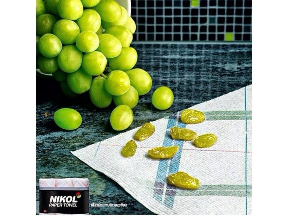
A great example of this done well is Nikol paper towels. They don’t actually turn grapes into raisins, but it shows the user the efficiency of the paper towels in an exaggerated, fun way.

Real-Life Ad Copy Examples to Inspire You
If you’re struggling to come up with ideas for your ad copy, take some inspiration from brands who are already writing high-converting copy:
- LootCrate
LootCrate created a game that used a game for Facebook users to participate in. They don’t actually talk about their monthly LootCrate at all, but potential customers instantly know that the product is related to Marvel.
If they are a Marvel fan and enjoyed playing the game, they are likely to click the link and find out more about this company.

- Dollar Shave Club
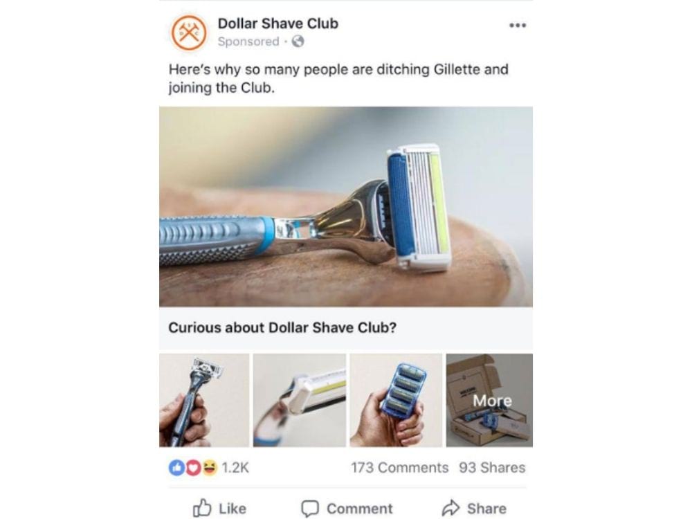
This clever ad from Dollar Shave Club has a hint of humor (which is in line with their brand) and immediately shows them as superior to a leading competitor in their niche.
The best part of this ad copy is the simplicity. If a user is already a Gillette user, they’ll instantly feel spoken to by this company and it plays on FOMO in an effective way.

- Snag Tights
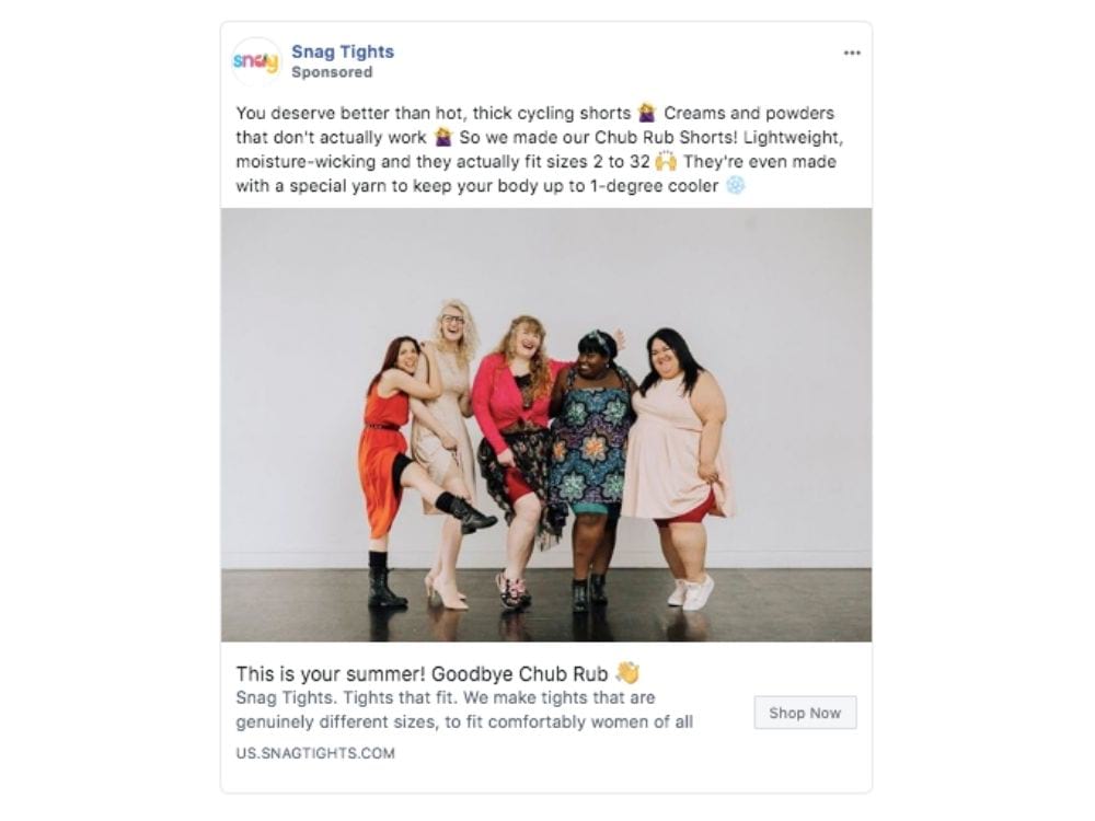
This ad from Snag Tights hits almost every important point we’ve talked about in this post:
- Immediately hit the customer’s pain points (hot thick cycling shorts)
- Have a fun on-brand name of their product that catches attention (chub rub shorts)
- Highlight an important benefit (keep you 1 degree cooler)
- Use a unique, on-brand image that evokes emotion
- Keep the ad copy on brand throughout with fun, playful language

Conclusion
The most important takeaway from this post is the need to constantly test, tweak and improve your ad copy when advertising. No one gets it spot-on the first time, so test different variations to see what resonates with your audience best.
If you’re struggling to write engaging ad copy, we’re here to help. Send us a message or give us a call and let’s see how we can make your ads more click-worthy.

