
So you’ve got an incredible offer for potential customers. Whether it’s a product or service, you know it’s something people need and want and it’s going to be a hit. You’ve got to grips with PPC ads, but you’re just not getting the conversions you need on your landing pages.
Why aren’t people taking your offer? The problem is probably your landing page. If it’s not optimized for conversions, it doesn’t matter how amazing your offer is, you’re not going to get high conversion rates.
If you’re struggling with creating professional, optimized landing pages, this guide is for you.
If you’re struggling to make sense of click-through rates and why you’re not getting the CTR that you’re hoping for, we’ve also got just the guide for you to get started with first.
Understanding Landing Pages
Before we dive into the specifics of creating high-converting landing pages, it’s important to understand what a landing page is trying to achieve.
Landing page vs. homepage: what’s the difference?
The main difference between a homepage and a landing page is the goal. When someone lands on your homepage, there are a lot of options for them. They can get to know your brand, check out your different products or services, click through to different areas of your website, and maybe sign up to your mailing list.
On the other hand, a landing page has one clear goal. Whether it’s to get someone to sign up to your mailing list, buy a product, or book a consultation with you, there is just one option for them, taking away all other distractions.
Benefits of Effective Landing Pages
- Give a great first impression
If someone clicks on a paid ad of yours after you’ve created a keyword optimized campaign and gets taken to a professional looking landing page, it gives a great impression of your brand.
Websites can be cluttered and difficult to navigate, whereas landing pages keep things simple and clean for potential customers.
- High conversion rates
The average landing page conversion rate across industries is 2.35 percent, with the top 25 percent converting at 5.31 percent or higher.
What’s more, Companies with 10 to 15 landing pages increase leads by 55 percent.
- Fewer distractions
Our attention spans online are getting shorter all the time, so the fewer distractions you can give to potential customers, the more likely they are to stay engaged.
Landing pages have a single message with no extra links or ads to pull the user’s attention away.
- Encourage specific action
Your website is full of links to click and pages to visit, so it’s almost impossible to control user behavior.
Landing pages usually have one action for users to take, so they really only have two options: take your offer or leave your landing page. This lack of choice helps boost conversions significantly.
Anatomy of a Landing Page
Your landing page needs to be customized to your offer and who you’re talking to. But there is a basic anatomy you can follow to create a professional looking landing page.
Headline
Begin with a bold, eye-catching headline that captures the message of your landing page. Without reading anything else, your potential customer should get a sense of what your offer is just from the headline.
Make sure the headline is the largest font and bold to draw the user’s attention to it before anything else.
Subheadline
This comes next to give the user a little more detail about your offer. After reading your headline and subheadline, your potential customer should understand what you do and what you’re offering.
Visuals
If you decide to add graphics to your landing page, it should complement the overall design. Don’t add any graphics for the sake of visuals, make sure they add to the story of your offer and enhance the message.
Testimonial
Social proof is one of the most effective ways to gain new customers. In fact, 70% of people trust recommendations from people online, even if they don’t know them.
If you have testimonials from past clients, adding just one or two to your landing page is a must.
Core benefits
When you have a great offer for customers, it’s easy to get caught up in giving them all the details of your offer. But this will quickly clutter your landing page and you’ll lose their interest.
Instead, focus on the key two to four benefits of your offer. And when we say benefits, we mean the reasons why your customer should buy your product or service.
For example, if you’re selling a marketing eBook, don’t list the chapter titles or talk about the content of the book. Instead, talk about the results your clients will see when they implement the teachings.
This will help them visualize the value of your product and make them want to buy it.
Call-to-action
Make sure the CTA on your landing page is clear, bold, and active. A button that says “Click here to learn more” isn’t motivating enough.
Make sure it includes more unique action words and encourages action:
- Try it for free now
- Create your account
- Sign up for free
- Claim your voucher
- Book a free consultation
- Shop the collection here
- Join our exclusive group
How to Create a Landing Page That Converts
Once you have the basics of a high-converting anatomy, you can get into the nitty gritty of optimizing your conversions.
Conduct Market Research
Doing a deep dive into the importance of market research is outside the scope of this article. But before you even start building your landing page, you should have your target audience nailed down by conducting competitive market research.
Make sure you know exactly who you’re talking to and how to talk to them before making any landing page decisions.
If you’re struggling to create high-converting PPC campaigns, check out this comprehensive guide on the different PPC formats.
Design Your Landing Page
The design of your landing page will make or break it. Since it’s a single page, it needs to immediately reflect your brand and style, while looking cohesive and easy to navigate.
The first step is color theory. Keep this incredibly simple with just three colors:
- Background: Opt for white or dull, subtle tints for the background to keep attention focused on the content
- Base: This should take up around 30% of the landing page and will be used in the header, form, and on the footer (if you have one).
- Accent: This is the color of your CTA so needs to be bright, bold, and stand out against all other colors.
When designing your landing page, focusing on simplicity. The fewer elements you can include, the better. A cluttered page will overwhelm users and make them click away.
Incorporate Videos into Your Landing Page
Landing pages that incorporate video have a 34% higher conversion rate. Users love short, engaging videos as these give an easier medium to consume content.
Whether you have a service or product, think about creating a high-quality promo video to add to the page. Just one to two minutes is long enough to capture the benefits of your offer while keeping your user’s attention.
Optimize your lead generation form
According to Niel Patel, an optimized lead gen form can increase your conversion rate by up to 672%, which is impressive, to say the least. Here are a few quick tips to do that:
- Place it above the fold: this is where attention is highest and clicks are most likely
- Have an actionable CTA: remember, “click here” just isn’t going to cut it.
- Remove barriers: if you offer free shipping, a money-back guarantee, or other offer that will help your customer overcome concerns.
- Remove unnecessary fields: do you really need your customer’s address on the form? If not, remove it. The more personal information they have to hand over, the less likely they are to sign up.
- Align your copy: If your landing page talks about a course, don’t then talk about downloading an eBook in your form. This minor confusion will put off a lot of users.
Incorporate a live chat
Around 41% of customers expect websites to have a live chat feature, and 38% of customers are more likely to buy from a company if they have live chat.
It not only makes it easier for customers to get quick answers to questions before making a purchasing decision, but it makes your brand look more trustworthy.
Make it Mobile Responsive
In many online marketing categories, over 80% of users are on mobile and this number grows every year.
You can’t afford for your landing page to be unresponsive to mobile users. Make sure it works well on both desktop and mobile to capture as many users as possible.
Avoid Adding Outside URLs
The only URL on the entire landing page should be your CTA. Whether it’s a link to a different part of your site or an outside source, this is giving customers an opportunity to leave unnecessarily.
When on the brink of a buying decision, users will actively look for reasons not to buy. Outside URLs are giving them that chance to get out, even if your offer is perfect for them.
Awesome landing page examples
If you’re looking for some landing page inspiration, here are some of our all-time favorites:
- Slack
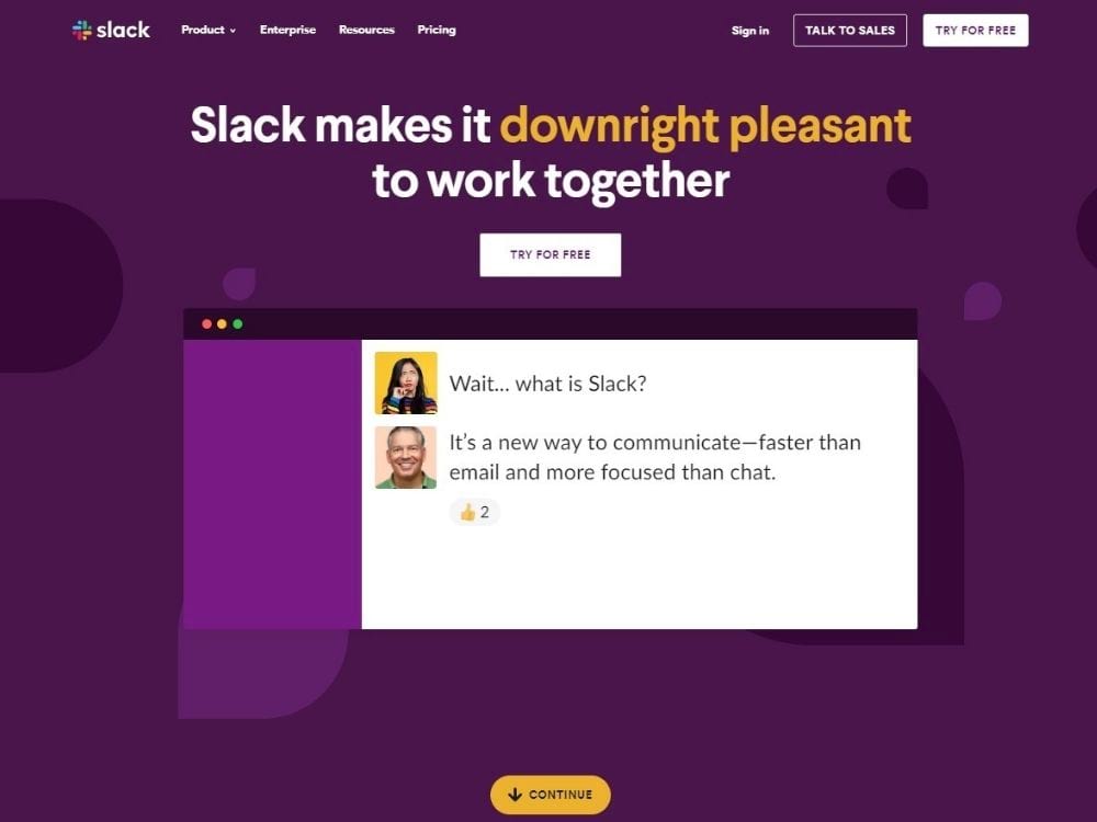
The color scheme is simple, the heading is bold and eye-catching, and they’ve actually used a screenshot of their own software to explain what they do – a clever way to communicate the software to potential customers.
- Loomly
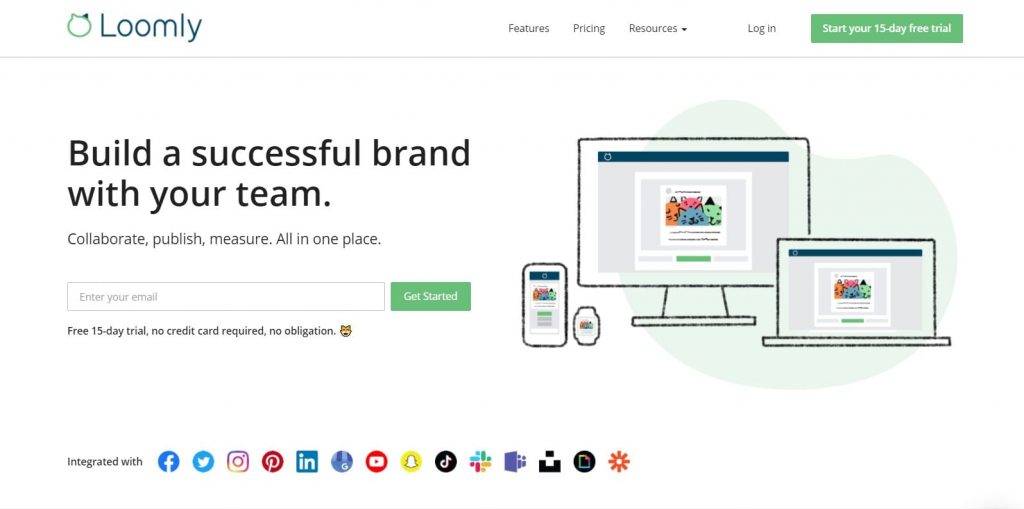
The graphics are high-quality, the CTA stands out with the bright green color, and the CTA is above the fold. You’ll also notice they’ve included terms and conditions just under the CTA to help customers overcome doubt.
- Doordash
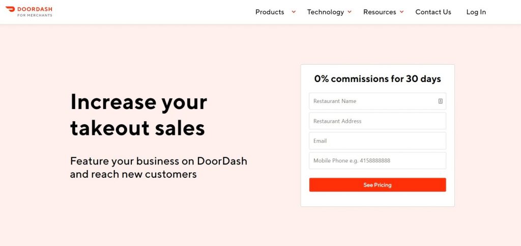
There is hardly any content at all on this Doordash landing page, but it still successfully communicates the benefits of its service and highlights the main offer (0% commissions). The colors scheme is also very simple, helping the CTA stand out.
- Shopify
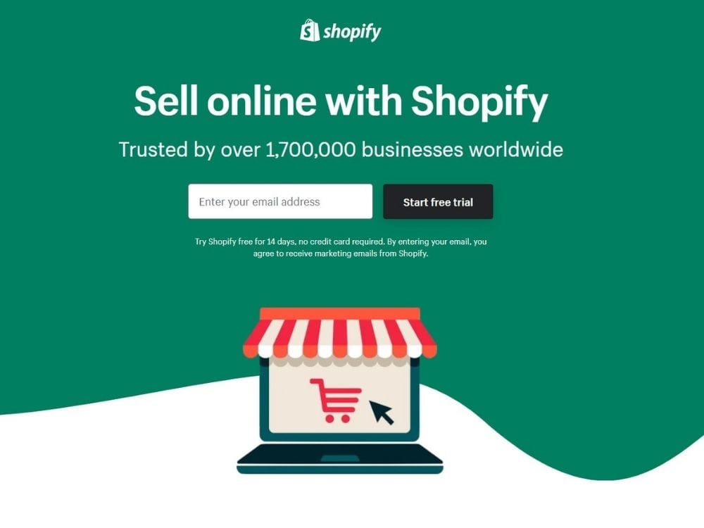
Shopify has hit all the goals with this landing page:
- It shows off how high-quality their websites look with quality graphics and a unique color theory
- It includes social proof (trusted by 17,000 businesses)
- The CTA stands out being black with white font
- It removes barriers by offering a free trial
- And it clearly states what they do (sell with Shopify)
Next Step: Get More Leads to Your Landing Pages
Now you know how to create landing pages that look fantastic and convert more leads, you need to get more people to your landing page.
That’s what we do at Bant! We help businesses create high-converting PPC and retargeting ads that get more eyeballs on their landing pages.
Schedule a personalized demo today and start improving the conversion rates on the campaigns you’ve been working so hard on.

Nick
Nick Biggs is a content marketer from Denver, CO. He helps B2B companies develop awesome content to connect with their audience. When he's not working on content strategy, you might catch him out in the mountains, attempting a home reno project, or planning his next adventure.